Having a properly customized and organized website is a must for online businesses.
If your website is difficult to navigate, people won’t bother staying reading your content, plain and simple. They may read one of your articles, and then just move onto another website.
Proper navigation and organization of your website lead to
- Increased page views and session duration
- Decreased bounce rate
- Better user experience and satisfaction
- Simplicity and easiness browsing through it
- Increased trust in your words and your products or the products that you recommend
Everything just mentioned is a metric affecting your search engine rankings, your overall customer satisfaction, and consequently your revenue.
Haven’t you ever visited a website which was so confusing that you left without even reading the first sentence of the article?
I have, and I can imagine that most people are acting the same way with such websites and truth be told, why not?
If a website’s navigation and appearance is sloppy and confusing, why would its content be better right?
Thankfully, WordPress has made it very easy for us to keep our website properly organized and customized and in this article, I am going to show you exactly how to do it yourself in order to give your visitors one more reason to trust you and stick around for more of you!
This is lesson #6 of my affiliate marketing course for beginners.
If for any reason you have not yet completed my previous lessons, please do, before going any further.
You can find the links right below:
- What is Affiliate Marketing and How It Works. (Lesson #1)
- What is a Niche Marketing Strategy? Finding Your Niche! (Lesson #2)
- Create Your Own Business Website for Free, in Less Than 2 Minutes (Lesson #3)
- How to Set Up a WordPress Website for Beginners (Settings, Plugins, etc)… (Lesson #4)
- Creating Initial Website Content… The Foundation of Your Success! Lesson #5)
Let the customization commence!
Fully Customizing our WordPress Website
No matter the quality and features every single WordPress theme offers, there’s always something that you’d wish and sometimes have to change before ending up with an optimum result.
Before we go any further, I want to point out that the individual customizations and settings that we’re just about to go through in this article will most likely vary depending on the appearance theme that you have chosen for your website.
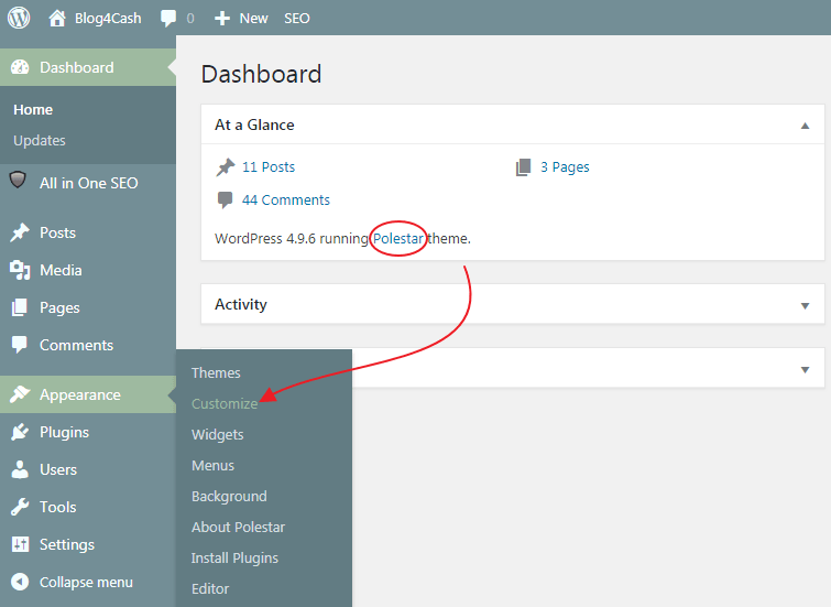
For this demonstration, I am going to be using the “Polestar” theme, which is also my default theme right now.
Please be advised that your specific theme selection will definitely impact your ability to follow through with certain changes while offering you others that my current theme might not offer(your theme’s options and settings might be less, more, named differently, and placed under different tabs on the customization bar, etc).
That’s why, before starting our website’s customization, I will briefly explain my theme’s available options and settings.
Website Customization Settings and Options Brief Overview
First, log in your website’s admin dashboard and go to “Appearance” -> “Customize”
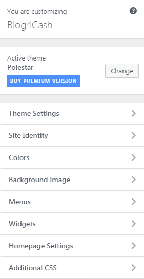
On the left-hand side of your screen, you will be seeing a bar like this below. This is called the “Customization Bar”.
On the right of the customization bar, you will be seeing your website’s preview which will be changing in real time while modifying the settings.
Let’s briefly explain the settings.
1- Theme Settings
In here you are going to be able to customize some basic, general settings of your website such as:
- Header image and logo
- Typography(text fonts, colors, etc)
- Navigation, sidebar, and footer appearance and positioning
2- Site Identity
This option lets you:
- Update your site title and tagline
- Upload a favicon
3- Colors
Change the background color of your website
4- Background Image
Instead of using a color, this setting allows you to use an image for your background.
5- Menus
In here we will be creating our first menus, positioning them, adding pages, posts, and categories to them.
Proper navigation is really important for the success of our online business and that is why in this article we are going to concern ourselves mainly about that.
6- Widgets
A WordPress Widget is a small block that performs a specific function. You can add these widgets in widget-ready areas on your website such as the sidebar or the footer.
A widget could be
- a video
- an image
- HTML code
- Calendar
- Search box
- Recent comments
- etc
7- Homepage Settings
Choose between a blogroll(latest posts) or a static page for your Homepage.
If you are a beginner, I would recommend choosing the blogroll option.
8- Additional CSS
CSS(Cascading Style Sheets) is basically a style sheet language.
It is used to customize most of our HTML website’s appearance features such as
- Text size, color, style, etc
- Typography
- Element positioning
- Layout
- Columns
- Etc
Note: If you have no CSS knowledge, I would suggest that you don’t mess with this option at all.
Before we go any further, I want to point out once more that the individual customizations and settings that we’re just about to go through in this article will most likely vary depending on the appearance theme that you have chosen for your website.
For this demonstration, I am going to be using the “Polestar” theme, which is also this website’s default theme right now.
Please be advised that your specific theme selection will highly impact your ability to follow through with certain changes while offering you others that my theme might not offer.
Your theme’s options and settings might be less, more, named differently, and placed under different tabs on the customization bar.
Let’s get to it then!
Creating, Positioning, and Customizing your WordPress Sidebar
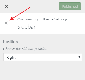
On your customization bar, choose “Theme Settings” and then “Sidebar”.
On the drop-down menu choose the “Right Position” for your sidebar and then hit “Publish”.
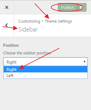
Hint: You should be placing your sidebar on the right-hand side of your website as the human eye and brain have adapted to scanning words from left to right… Having a sidebar on the left-hand side of your website will be distracting for the reader as when they finish a line their eye will naturally start scanning from the far left of the page, which means your sidebar and not your content.
It is possible that your sidebar has not shown anywhere on your website yet.
That’s because there are no widgets on your sidebar by default.
Let us add them now!
Hit the back button twice until you get to the main menu of your customization bar.
Then hit “Widgets” -> “Sidebar” and then “Add a Widget”.
A list of widgets will appear to the right of the “Add a Widget” button.
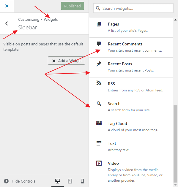
You could practically add any widget you want to your sidebar, but for starters, I recommend keeping things simple by adding just the “Search”, “Categories”, “Recent Posts”, and “Recent Comments” widgets, preferably in this exact order.
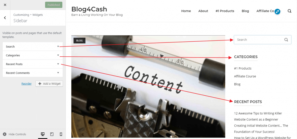
Hit publish once more, and you are done with your sidebar.
Let us get started with your main menu!
Creating your Main Menu
Most themes, automatically add new pages to their main navigation menu the moment they get published.
If you can see that the pages you created in our last lesson have been automatically included in your main navigation, worry not…
We will sort everything out together!
Before starting with the menu though, we have to create some post categories to include in it.
Post categories help us categorize our posts according to our liking; I usually categorize my posts based on their content.
When a visitor clicks any one of the categories, they will be seeing only those posts which you have categorized under it.
Go ahead and log in your admin’s dashboard and hit “Posts” and then “Categories”.
Write your category name on the “Name” field and then scroll to the very bottom and hit “Add New Category”.
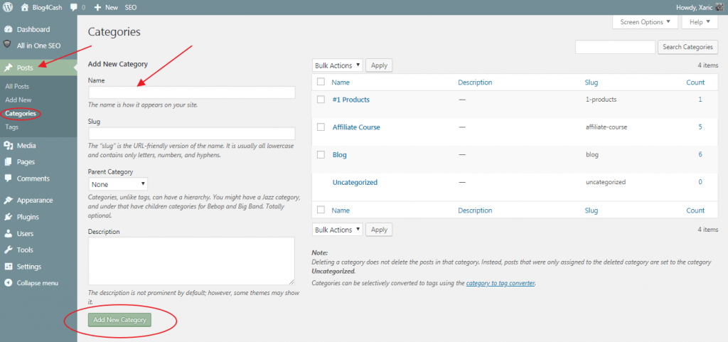
Your first category has been added… Yes, it was that simple!
Make sure to add 3-4 different categories if possible and appropriate.
Please be advised that your categories should be relevant to the content you will be creating as well as your website.
For example, if you are running a “Men’s Shoes” website a few category ideas could be
- Casual shoes
- Running shoes
- Comfortable shoes
- Flipflops
- Socks
Since we have already included a category widget in our sidebar earlier, the categories that you just created are going to be automatically shown there as well.
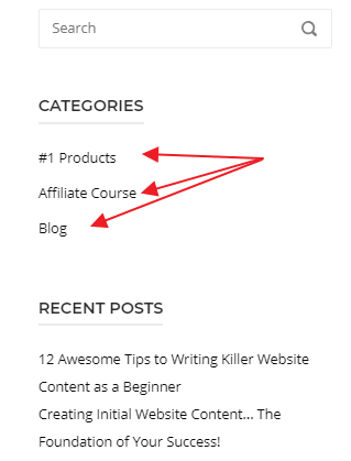
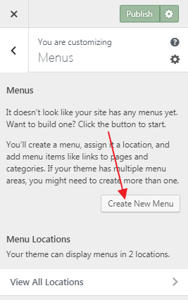
After you have created your categories, go ahead and click “Appearance” -> “Customize” again. Then on the customization bar, click the “Menus” option and then “Create New Menu”.
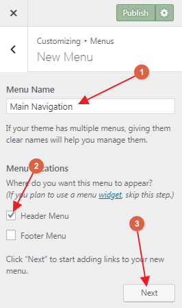
Then go ahead and choose your menu’s name(this name is just for your own use and it won’t be visible to your visitors), set it as a header menu, and click next.
Now hit “Add Items” and add to your menu the “Home” and “About Me” pages, as well as 3-5 of your previously created categories.
Publish!
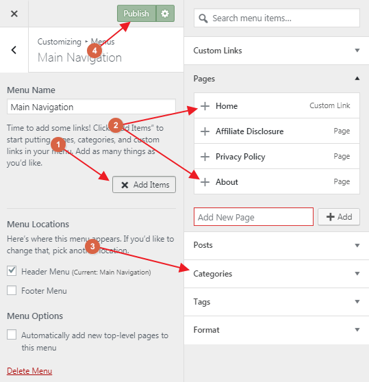
Note: We are not adding our Privacy Policy and Affiliate Disclosure pages to our main menu because:
- They are not that important
- They are duplicate content
- We have discouraged the search engines to rank them
- We are going to add them to the footer menu later on(if anyone would like to read one of those pages, let them look for them).
Your main menu should be up there now and your website is probably looking something like mine below.

If you prefer video tutorials, go ahead and take a look at this detailed, step by step video walk-through of the whole process of customizing your sidebar and main navigation, created by Wealthy Affiliate’s CEO, Kyle.
Basically, you are done with the customization of your website so you could move on to lesson #7 right now.
However, I won’t conclude this tutorial at this point, as I am going to proceed with some more optional website settings.
I highly suggest that you follow through until the end of this tutorial.
Uploading Your Website Logo
On your customization bar, choose “Site Identity” and then “Select Logo”.
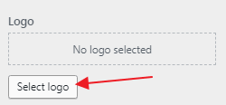
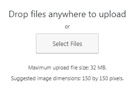
Then click “Select Files” and upload your logo from your computer.
When your logo has been uploaded, hit “Select”.
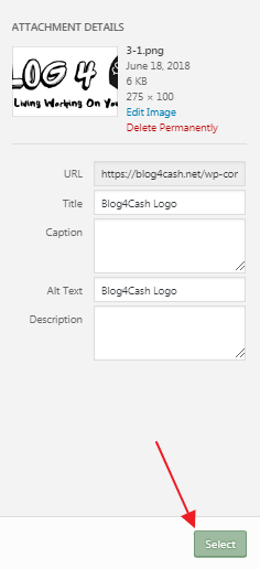
Hit “Publish” and your website logo is now set!

If you have no available logo for your website, you can go to logojoy.com and very easily create one… I created mine there in less than 10 minutes.
Setting Your Favicon
A favicon is this little icon which in most browsers is shown on the website’s tab, above or next to the URL.

To upload your own favicon, go to “Site Identity” and scroll down where it says “Site Icon” and hit “Select Image”.
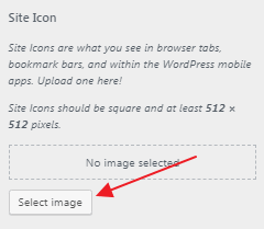
Upload your favicon, select it, publish and you are done.
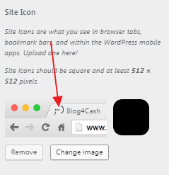
If you don’t have a favicon, you can find some for free on the websites below:
Hint: A favicon is a finishing touch that helps to differentiate your website from your competitors. Most businesses commonly use a small version of the website logo in order to be consistent with the branding of their website. The goal is to create a favicon that’s easily identifiable when displayed in a browser tab or bookmarks bar.
Customizing Your Footer
Most themes offer more than one widget-ready areas(places like the sidebar where you can add widgets).
Polestar’s footer is one of them, so we are going to add a “Categories” widget as well as a custom menu widget there.
Let’s create the menu first!
On your customization bar choose “Menus” -> “Create New Menu”.
Name it “Footer Menu” and click “Next”.
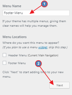
Then go ahead and add to your menu the “Home”, “About me”, “Privacy Policy”, and “Affiliate Disclosure” pages and hit publish again.
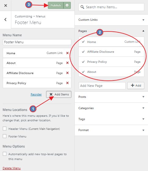
Your footer menu is ready!
All you have to do right now is include it in the footer of your website.
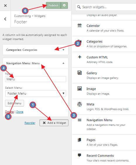
On your customization bar click “Widgets” -> “Footer” -> “Add a Widget”.
Then go ahead and add a “Categories” and a “Navigation Menu” widget.
On the navigation menu widget, set “Menu” as a title.
On the dropdown menu choose the “Footer Menu” that you created earlier.
Hit publish!
Now you should be able to see those widgets down the footer of your website.
Some Useful Tips
As a beginner, I recommend that you don’t pay that much attention to making your website look beautiful as no one really cares about its appearance(at least as long as it isn’t so messy that it distracts the reader).
Your visitors are going to judge your website based on its content and not based on its looks.
I have stored many not so great-looking websites in my favorites, reading their high-quality content regularly. I have also come across others which were beautiful, offering me nothing but boring, crappy content.
For beginners, I recommend spending your time and efforts mainly towards creating quality content for your website and not on designing logos and changing your website’s text color from blue to red and back to blue again and again, and so on.
On the other hand, try to keep your website minimal, with clean navigation, and internal links throughout your articles in order to help every single visitor find what they are looking for faster and with less effort on their part.
Don’t forget that the visitor you helped through your content is more likely to be a permanent customer of yours that the one who got bored of your content but found your website good-looking.
My tip for you is this:
From the time you leave this lesson and until you have posted 15-20 articles on your blog, do not even bother adjusting your website’s appearance. Just start and keep producing content… This should be your #1 priority.
When you are up to 20 articles, you can sit back and spend some days, maybe a week, experimenting and adjusting your navigation, logos, colors, themes, menus, categories, etc.
Concluding This
If you have followed every single one of my lessons, applying everything you learn, you have now built a pretty solid foundation for your online business.
Now all you have to do is keep scaling it upwards by creating content which will attract visitors to your website.
However, random content is not going to help that much.
You have to learn how to target the right audience by using specific keywords and that is what we are going to be learning in our next lesson.
If you have any questions or need any further help or guidance from me, I encourage you to leave a comment below or email me at harry@dearboss-iquit.com.
You could also send me a PM at my Wealthy Affiliate Profile.
Whatever the case, I will get back to you as soon as possible.
My best regards to you,
Harry,
dearboss-iquit.com
